August 5, 2026
Healthcare Claims Analytics: Reduce Denials and Forecast Cost
Discover how healthcare claims analytics can reduce denials and forecast costs effectively. Start improving your processes today!

Healthcare Claims Analytics: Reduce Denials and Forecast Cost
TL;DR:
- Swipe Credit AI — clearer business opportunities, governed support, and measurable outcomes with human control.
Healthcare claims analytics turns coded billing records into repeatable business signals that cut denials, reveal cost drivers, and support multi-year financial forecasting. If you’re an analyst, finance leader, or benefits decision-maker, here’s where to start in the next 30–90 days:
- Inventory your claims sources this week: identify which medical, pharmacy, and enrollment feeds you have, how often they refresh, and where gaps exist.
- Run a 30-day denial root-cause check: pull your most recent denial file, group by reason code, and flag the top three denial categories by dollar volume.
- Pick one pilot use case (denial management or A/R reduction are the fastest cash-flow wins) before committing to a broader population-health or forecasting project.
The KPIs that matter most at the start: denial rate as a percentage of billed claims, days in accounts receivable (A/R), and allowed-to-billed ratio. Benchmark-enriched datasets that refresh in days rather than weeks give you the fastest signal-to-action cycle.
Table of Contents
- What a claims record actually contains, and which fields drive analytics
- Research signals, common pitfalls, and where Swipe Credit AI fits
- How raw claims become analysis-ready: the ETL pipeline
- What breaks claims analytics and how to fix it
- Core analytical methods and the KPIs that matter to each team
- High-impact use cases with measurable outcomes
- What to look for when evaluating a claims analytics platform
- Implementation checklist: 90–180 day roadmap
- Best practices for keeping claims analytics programs healthy long-term
- Key Takeaways
- The part most analytics teams get wrong
- Swipecredit makes claims analytics faster and less painful
- Useful sources
- FAQ
What a claims record actually contains, and which fields drive analytics
A single medical claim is a structured document with two layers: the claim header (who, when, where) and service lines (what was done and what it cost). Analysts who know which fields to pull first save hours on every project.
Core medical claim fields:
- Member/enrollee ID: the unique identifier linking claims to enrollment and eligibility records
- Dates of service: admission, discharge, and service-line dates for episode construction
- Provider NPI and taxonomy: identifies the billing and rendering provider, critical for network and site-of-care analysis
- CPT/HCPCS procedure codes: what was done; the primary driver of cost-attribution and utilization analysis
- ICD-10-CM diagnosis codes: why it was done; essential for risk stratification and HCC scoring
- Place of service (POS) code: hospital outpatient vs. physician office vs. ambulatory surgical center, which drives dramatic cost differences for identical procedures
- Billed amount, allowed amount, and paid amount: the financial triangle that reveals contract performance and leakage
Pharmacy claims follow a different schema. The key fields are the National Drug Code (NDC), fill date, days supply, prescriber NPI, dispensing pharmacy NPI, and the NADAC (National Average Drug Acquisition Cost) reference price. Because pharmacy uses a completely different code set from medical, most analytics pipelines require a separate ingestion path and a crosswalk to therapeutic class groupings before the two can be joined for total-cost-of-care analysis.
The real analytic power comes from combining fields. Map diagnosis code + CPT + POS together and you can answer a question like: “How much are we paying for knee arthroscopy in a hospital outpatient setting versus an ambulatory surgical center?” That single query often surfaces six-figure savings opportunities in mid-market self-funded plans.
Claims data is best understood as a coded chronicle of the patient journey, not just a billing document. Every service line carries a clinical signal — diagnosis, procedure, provider, setting — that, when read together, tells you where care is happening, whether it’s appropriate, and what it costs. Analysts who read claims that way consistently find insights that pure financial reporting misses.
A useful visual to build for your team: a single-claim diagram with four zones highlighted in different colors — claim header (member, dates, payer), provider identifiers (billing NPI, rendering NPI, POS), coding block (ICD-10, CPT/HCPCS, modifiers), and amounts (billed, allowed, paid, patient responsibility). That one diagram answers 80% of the “what does this field mean?” questions from new analysts.

Research signals, common pitfalls, and where Swipe Credit AI fits
Published research and platform benchmarks point to three recurring failure modes in claims analytics programs: data that arrives too slowly, coding that varies across sources, and missing member identifiers that break enrollment joins.
Academic experience reports analyzing multi-year claims repositories document coding irregularities, code-set variation across payers, and the difficulty of defining episodes of care as the most common analytic obstacles. These aren’t edge cases. They show up in nearly every implementation.
On the platform side, MedInsight is relied on by more than 300 payers and ACOs and offers benchmark-enriched data that refreshes in days rather than weeks. That refresh cadence matters because a denial trend you catch in 72 hours is recoverable; one you catch after a monthly batch run has already cost you a full billing cycle.
If you see this, do that:
- Data lag (weekly or monthly feeds): Prioritize near-real-time or daily incremental loads; negotiate SLA terms with clearinghouses before signing.
- Inconsistent provider codes: Standardize to NPI as the primary provider key; build a crosswalk table for legacy IDs.
- Missing member identifiers: Flag records with null or mismatched member IDs before they enter your analytics schema; route them to a quarantine table for manual review.
- Code-set variation (ICD-9 remnants, mixed CPT/HCPCS): Apply a vocabulary mapping layer at ingestion; consider an OMOP-style common model for cross-source work.
- Duplicate claims: Run a deduplication check on claim number + service date + provider NPI + procedure code before loading to your reporting layer.
Swipecredit’s enterprise AI platform addresses these exact bottlenecks. It ingests multi-source claims feeds, normalizes coding to a common schema, and delivers role-based dashboards so finance, clinical ops, and risk teams each see the view they need without waiting on a data team ticket. If your program is stalled at the data-quality or reporting stage, see how Swipecredit accelerates claims analytics outcomes for payers and self-funded employers.
How raw claims become analysis-ready: the ETL pipeline
Raw claims files arrive in vendor-specific formats: 837 EDI transactions, flat-file extracts, or proprietary payer exports. Getting from that raw state to a query-ready analytics schema takes five distinct stages.
The five ETL stages:
- Ingest: Pull files from clearinghouses, TPAs, or payer portals; log file receipt timestamps and row counts for audit trails.
- Normalize: Standardize field names, data types, and code formats (e.g., strip leading zeros from NDC codes, enforce ICD-10 format).
- De-duplicate: Apply claim-level deduplication logic before any aggregation; duplicate claims inflate utilization and cost figures.
- Enrich: Apply groupers (DRG, ERG, pharmacy therapeutic class) to bucket thousands of CPT/ICD codes into clinically meaningful categories; this step is what makes cost-attribution reliable.
- Load: Write to an analytics schema with separate tables for claim headers, service lines, member enrollment, and provider reference data.
Vocabulary mapping is where most teams underinvest. Raw claims use payer-specific code variations, legacy ICD-9 codes in older data, and inconsistent modifier usage. The OHDSI OMOP Common Data Model provides a well-documented approach to mapping diverse clinical and claims sources into a single research-ready structure. Even if you don’t implement OMOP fully, adopting its vocabulary hierarchy for diagnosis and procedure codes eliminates the “different dialects” problem that breaks cross-payer comparisons.
For the data layer itself, structure tables so analysts can join without guessing: a claims_header table keyed on claim ID, a claims_lines table with one row per service line, a member_enrollment table with effective/termination dates, and a provider_reference table with NPI taxonomy. Incremental loads should append new claims and update adjudicated amounts on existing records, not replace the full table.
Pro Tip: Implement strict pipeline versioning and logging from day one. Every ETL run should write a log record with the file source, row counts in and out, rejection counts, and the pipeline version number. When a CFO asks why last quarter’s denial rate looks different from the board report, you need to answer in minutes, not days.
What breaks claims analytics and how to fix it
Bad data doesn’t just produce wrong answers. It produces confident wrong answers, which is worse. A denial-rate dashboard built on duplicate claims will show improvement that isn’t real. A cost-trend model with enrollment mismatches will overstate per-member-per-month (PMPM) costs for entire populations.

| Data Quality Issue | How It Manifests | Quick Detection | Pragmatic Fix |
|---|---|---|---|
| Missing/null member IDs | Enrollment joins fail; PMPM calculations are wrong | SELECT COUNT(*) WHERE member_id IS NULL |
Quarantine nulls; trace back to source feed |
| Inconsistent provider NPIs | Network analysis breaks; duplicate provider records | Compare NPI to NPPES registry | Standardize to 10-digit NPI; build a crosswalk |
| Date/service-line mismatches | Episode construction fails; readmission flags are wrong | Flag claims where discharge date < admission date | Validate date logic at ingest; reject malformed records |
| Code-set variation (ICD/CPT/NDC) | Cross-period comparisons break; groupers misfire | Check for ICD-9 codes in ICD-10 fields | Apply vocab mapping at normalization stage |
| Duplicate claims | Utilization and cost figures are inflated | Dedup on claim# + date + NPI + procedure | Pre-load deduplication; log rejected duplicates |
| Enrollment mismatches | Members appear in claims but not in eligibility | Left join claims to enrollment; flag unmatched | Reconcile enrollment feed timing with claims feed |
| Delayed feeds | Trend lines show false drops at period end | Monitor file receipt timestamps vs. expected SLA | Set automated alerts for late or missing files |
The business cost of bad data is direct. Inaccurate denial tracking means you’re chasing the wrong root causes. Enrollment mismatches inflate PMPM costs and can cause a self-funded employer to overfund their stop-loss reserve. Poor coding quality in HCC scoring leads to risk scores that misrepresent population severity, which flows directly into renewal pricing errors.
Pro Tip: Build a “data confidence score” for each reporting period before any dashboard goes live. Track four metrics: enrollment match rate, claim-to-enrollment join rate, duplicate rejection rate, and feed timeliness. Set a threshold (e.g., 95% on all four) and fail-fast: don’t publish reports until the data clears it.
Core analytical methods and the KPIs that matter to each team
Claims analytics isn’t one thing. It’s three progressively more powerful modes of analysis, each answering a different business question.
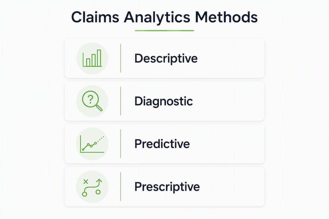
Descriptive analytics answers “what happened”: claim volume by month, top-10 diagnosis categories by cost, procedure rate per 1,000 members, denial rate by reason code. This is the foundation. Every organization should have reliable descriptive reporting before attempting anything more complex.
Predictive analytics answers “what’s likely to happen”: which members are at high risk for a high-cost event in the next 12 months, which claims are likely to be denied before submission, which providers show utilization patterns that suggest coding irregularities. Common model types include logistic regression for denial prediction, gradient boosting for readmission risk, and HCC-like scoring for population risk stratification. The features that matter most come from rolling-window utilization (claims in the prior 6–12 months), pharmacy fill patterns, and diagnosis code combinations.
Prescriptive analytics answers “what should we do”: intervention recommendations for high-risk members, stop-loss attachment-point optimization, benefit design changes that reduce unnecessary utilization. This is where multi-year exposure modeling becomes critical. Platforms that model 3–10 year cost exposure help finance teams hold renewals to evidence-based forecasts rather than accepting carrier projections at face value.
KPIs by stakeholder:
- Finance: days in A/R, allowed-to-billed ratio, PMPM trend by category, stop-loss attachment exposure
- Clinical operations: readmission rate (30-day), procedure rate per 1,000 members, generic dispensing rate (pharmacy), ER utilization rate
- Risk and actuarial: HCC risk score accuracy, high-cost claimant concentration (top 1% of members as % of total spend), stop-loss lasering exposure
One practical note on model validation: before a predictive model goes into production, run a retrospective test on a held-out period. If your denial-prediction model was trained on 2023–2024 data, validate it against 2025 actuals. A model that looks strong in training but degrades in production is a common and expensive mistake.
High-impact use cases with measurable outcomes
The use cases below are sequenced by how quickly they return value. Start with the ones that improve cash flow in 60–90 days; layer in the longer-horizon work once you have stakeholder confidence.
1. Denial management Pull denied claims by reason code, group by provider and procedure, and identify the top three denial drivers. Expected outcome: a focused denial-reduction program can achieve a significant reduction in denial rate within 90 days. Required data: medical claims with adjudication status, denial reason codes, and provider identifiers.
2. A/R acceleration Identify claims aged beyond 30, 60, and 90 days; flag by payer and procedure category. Prioritizing follow-up on high-dollar aged claims is the fastest way to improve days in A/R without changing clinical operations.
3. Cost trend and utilization analysis Track PMPM by service category (inpatient, outpatient, professional, pharmacy) month-over-month. This is the core of benefit design work and the input to renewal negotiations.
4. Risk stratification and population health Score members by predicted cost using HCC-style models; identify the top 5% of members who typically drive 50%+ of total spend. Required data: medical + pharmacy + enrollment feeds joined at the member level.
5. Stop-loss planning Model individual and aggregate stop-loss attachment points using historical high-cost claimant data. An AI-driven claims analysis for a self-funded employer identified multi-million dollar savings from telehealth utilization shifts and plan design optimization. Those are the kinds of numbers that get CFO attention.
6. Employer-facing insights Self-funded employers increasingly expect their TPA or broker to deliver claims dashboards showing cost drivers, utilization trends, and year-over-year comparisons. This use case requires clean, normalized data and a reporting layer that non-analysts can navigate.
Sequencing advice:
- Start with denial management or A/R (cash flow wins in 60–90 days)
- Add cost-trend and utilization reporting in months 3–6
- Layer in risk stratification and stop-loss modeling in months 6–12
- Build multi-year forecasting models once you have 24+ months of clean history
What to look for when evaluating a claims analytics platform
Most platforms claim to do everything. The questions below cut through that quickly.
Feature checklist:
- Ingestion connectors for 837 EDI, flat files, and API feeds from major clearinghouses
- Code normalization and vocabulary mapping (ICD, CPT, HCPCS, NDC, NPI)
- Groupers (DRG, ERG, pharmacy therapeutic class) built in, not bolted on
- Benchmark-enriched data with documented refresh cadence
- Role-based reporting so finance, clinical, and risk teams each see their view
- API access for downstream data science work
- HIPAA-compliant infrastructure with documented de-identification capabilities
- Audit trails and data lineage for regulatory and CFO-level conversations
Evaluation questions to ask every vendor:
- How often does your benchmark data refresh, and what is the source?
- Do you provide raw data extracts, or only pre-built reports?
- What is your SLA for data latency from source to dashboard?
- How do you handle ICD-9 to ICD-10 transitions in historical data?
- What de-identification standard do you use, and is it Safe Harbor or Expert Determination?
- Can your platform scale to 10M+ claims per year without performance degradation?
- What does your implementation timeline look like for a mid-market payer?
Scoring rubric for RFP evaluation:
| Dimension | Weight | What to Assess |
|---|---|---|
| Data & ETL capabilities | 30% | Connectors, normalization, groupers, refresh speed |
| Analytics & reporting | — | Descriptive to prescriptive range, benchmark access |
| Security & HIPAA compliance | — | De-identification, BAA, SOC 2, audit trails |
| Integration & interoperability | 10% | EHR, pharmacy, enrollment, stop-loss feed support |
| Pricing & ROI timeline | 10% | Total cost vs. expected denial/A/R improvement |
For SMBs and mid-market payers, the fastest ROI usually comes from platforms that combine denial analytics and benchmark reporting out of the box, rather than requiring months of custom configuration before the first dashboard is live.
Implementation checklist: 90–180 day roadmap
A claims analytics program that tries to do everything at once usually delivers nothing. A focused 90–180 day pilot with clear success metrics is the right starting point.
Phase 1: Foundation (Days 1–45)
- Inventory all claims data sources and assess feed quality
- Sign BAAs with all data vendors and confirm HIPAA compliance chain
- Stand up ETL pipeline with logging, versioning, and data confidence checks
- Load 24 months of historical medical and pharmacy claims
- Validate enrollment join rate and deduplication results
Phase 2: First insights (Days 46–90)
- Publish denial dashboard with reason-code breakdown and dollar impact
- Deliver PMPM cost-trend report by service category
- Identify top 10 denial drivers and assign remediation owners
- Present findings to finance and operations leadership
Phase 3: Scale and model (Days 91–180)
- Add risk stratification model; validate against prior-period actuals
- Build stop-loss exposure model using high-cost claimant history
- Expand to employer-facing reporting if applicable
- Document pipeline, models, and governance for ongoing operations
Timeline and cost considerations:
| Milestone | Typical Timeline | Key Cost Bucket |
|---|---|---|
| Data ingest and normalization | Weeks 1–4 | Data engineering, ETL tooling |
| First denial/A/R dashboard | Weeks 5–7 | Reporting layer, grouper licensing |
| Predictive model (denial/risk) | Weeks 9–12 | Data science, model validation |
| Pilot close and scale decision | Weeks 13–16 | Governance, documentation, training |
A simple ROI rule of thumb: if your organization processes $10M+ in annual claims, a 10% improvement in denial recovery and a 5-day reduction in A/R typically covers the cost of a mid-market analytics platform within the first year. Tie your cash flow forecasting directly to these metrics so the business case is visible to finance leadership from day one.
Pilot success metrics to approve scale-up:
- Denial rate reduction of at least 10% vs. baseline
- A/R days improvement of 3–5 days
- Enrollment match rate above 95%
- Finance team confidence in PMPM trend accuracy
Best practices for keeping claims analytics programs healthy long-term
A claims analytics program isn’t a project with an end date. It’s an operational capability that needs regular maintenance to stay accurate and trusted.
Governance comes first. Assign a data steward who owns the pipeline, monitors data confidence scores, and signs off on reports before they go to leadership. Without a named owner, data quality degrades silently until a CFO question exposes it at the worst possible moment.
Refresh your groupers and code mappings annually. ICD-10 and CPT code sets update every October 1 and January 1, respectively. A grouper that hasn’t been updated misclassifies new codes, which corrupts cost-trend comparisons. Schedule a code-set review into your annual calendar.
Validate models in production, not just in development. A denial-prediction model that was accurate at launch will drift as payer behavior, coding patterns, and benefit designs change. Run monthly retrospective checks comparing model predictions to actual outcomes; retrain when accuracy drops below your defined threshold.
Build a feedback loop with clinical and finance teams. The analysts who build the models and the people who use the outputs need a regular touchpoint. A monthly 30-minute review where finance or ops flags anomalies in the dashboards catches data issues before they become decisions. AI analytics for growing businesses works the same way: the technology surfaces the signal, but humans close the loop.
Document everything for audits. HIPAA requires covered entities and business associates to maintain records of how PHI is used and protected. Your pipeline logs, BAAs, de-identification methodology, and access controls should be audit-ready at all times, not assembled under pressure when a request arrives.
Plan for data growth. A mid-market payer adding 5,000 members per year doubles its claims volume in roughly five years. Build your analytics schema and infrastructure to handle 3–5x current volume without a full rebuild.
Key Takeaways
Healthcare claims analytics delivers the fastest ROI when you start with denial management and A/R reduction, build a clean ETL pipeline with versioning and data confidence checks, and layer in predictive and prescriptive models only after the foundation is solid.
| Point | Details |
|---|---|
| Start with denial management | Denial root-cause analysis typically delivers a significant denial reduction within 90 days. |
| Data quality is the business case | Enrollment mismatches, duplicate claims, and delayed feeds directly inflate costs and corrupt forecasts. |
| Use OMOP-style vocab mapping | Standardizing to a common model like OMOP CDM prevents cross-source comparison failures. |
| Sequence pilots by cash flow impact | Denial and A/R wins in 60–90 days build stakeholder confidence for longer-horizon forecasting work. |
| Swipecredit accelerates the roadmap | Swipecredit’s AI platform handles ingestion, normalization, and role-based reporting to compress a 180-day build into weeks. |
The part most analytics teams get wrong
There’s a version of this conversation that happens in every organization that tries to build a claims analytics program: the data team spends six months building a perfect pipeline, and by the time the first dashboard is live, the finance team has already made renewal decisions based on the carrier’s numbers.
The conventional wisdom says “get the data right first.” That’s not wrong, but it’s incomplete. The teams that actually change financial outcomes start with a narrow question that has a dollar sign attached to it. Not “let’s build a claims data warehouse.” Instead: “We had $2.3M in denials last year. What were the top five reason codes?” You can answer that question with a 30-day data pull and a pivot table. You don’t need a perfect pipeline to start.
The governance and standardization work matters enormously, and the OHDSI OMOP CDM is genuinely the right long-term approach for organizations doing cross-source analytics. But governance built in isolation, without a business question driving it, becomes an IT project that never ships. The best programs I’ve seen run both tracks in parallel: a quick-win denial analysis that builds credibility with leadership, and a proper pipeline build happening in the background.
The other thing teams underestimate is the human side of data quality. The academic literature on claims data pitfalls documents the technical issues well. What it doesn’t capture is the organizational friction: the billing team that doesn’t know the analytics team needs clean member IDs, the TPA that sends a monthly file when you need weekly, the finance leader who trusts the carrier’s spreadsheet more than your dashboard because it’s been around longer. Fixing those problems requires stakeholder alignment, not just better SQL.
Build the quick win. Show the dollar impact. Then ask for the resources to build it right.
Swipecredit makes claims analytics faster and less painful
Swipe Credit AI helps teams turn permissioned business data into clearer opportunities and measurable economic outcomes while keeping people in control. Access and available capabilities depend on the selected plan and connected systems.
Swipe Credit AI helps teams turn permissioned business data into clearer opportunities and measurable economic outcomes while keeping people in control. Access and available capabilities depend on the selected plan and connected systems.
If you’re ready to scope a pilot or see a live demo of the claims analytics workflow, start with Swipecredit’s enterprise platform or review available services and engagement options to find the right fit for your organization’s size and timeline.
Useful sources
The sources below are the primary references used in this article. Each is worth bookmarking for ongoing claims analytics work.
- Key considerations when using health insurance claims data in advanced data analyses: an experience report — A peer-reviewed PMC paper documenting real-world coding irregularities, validation challenges, and lessons from a seven-year claims repository. Required reading for any team building a new pipeline.
- OHDSI — Observational Health Data Sciences and Informatics — The home of the OMOP Common Data Model and the OHDSI community. Use this for vocabulary mapping resources, CDM documentation, and cross-source research methodology.
- Guide to Health Care Administrative Claims Data — UTHealth Houston — A foundational reference on administrative claims data structure, use cases, and access considerations for researchers and analysts.
FAQ
What is healthcare claims analytics?
Healthcare claims analytics is the process of turning coded billing records (medical and pharmacy claims) into business intelligence that reduces denials, reveals cost drivers, and supports financial forecasting. It spans descriptive reporting, predictive modeling, and prescriptive recommendations.
How do you analyze healthcare claims data?
Start by cleaning and normalizing the data (deduplication, vocabulary mapping, enrollment joins), then run descriptive reports on denial rates and PMPM cost trends before building predictive models for risk stratification or denial prevention.
What is OMOP CDM and why does it matter for claims analytics?
The OMOP Common Data Model, maintained by the OHDSI community, is a standardized schema for mapping diverse clinical and claims sources into a single research-ready structure. It solves the “different dialects” problem that breaks cross-payer and cross-source comparisons.
How long does a claims analytics implementation take?
A focused pilot covering denial management and PMPM cost reporting typically takes 90 days. A full program including predictive models and stop-loss planning runs 90–180 days, depending on data readiness and team capacity.
Can Swipecredit help with healthcare claims analytics?
Swipe Credit AI helps teams turn permissioned business data into clearer opportunities and measurable economic outcomes while keeping people in control. Access and available capabilities depend on the selected plan and connected systems.